Screenshots
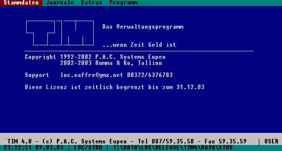
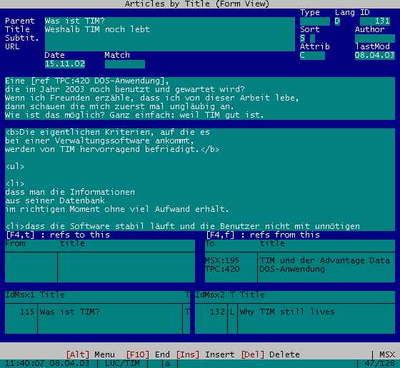
Just to give an idea of how TIM looks like.
The main menu is simple, well-structured and adaptable.
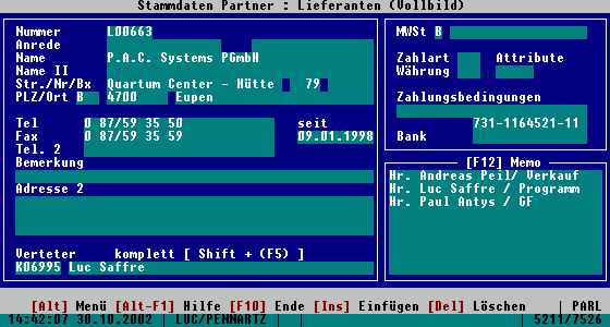
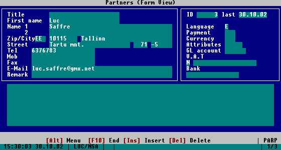
The screen form for Partner master data is usually adapted to the customer's needs.
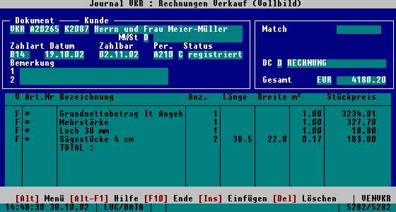
Also the form for Invoices is relatively variable:
A screenshot of the Web module which is used to create this site.
Some more screenshots in the following (German) article: Gönnen Sie TIM ein größeres Fenster (24.09.02)
Copyright 2001-2010 Luc Saffre.
http://tim.saffre-rumma.net
Generated 2010-12-19 01:04:08

